Tab groups
Repository tabs can be collected into named, colored groups. A group is an organizational label over the existing strip: it never changes what a tab does, never closes a tab, and never alters which repository a tab is bound to. Every non-empty group has a visible chip before its first member, so its name, color, member count, expanded/collapsed state, and active-group state remain readable without relying on the members' color bands alone.
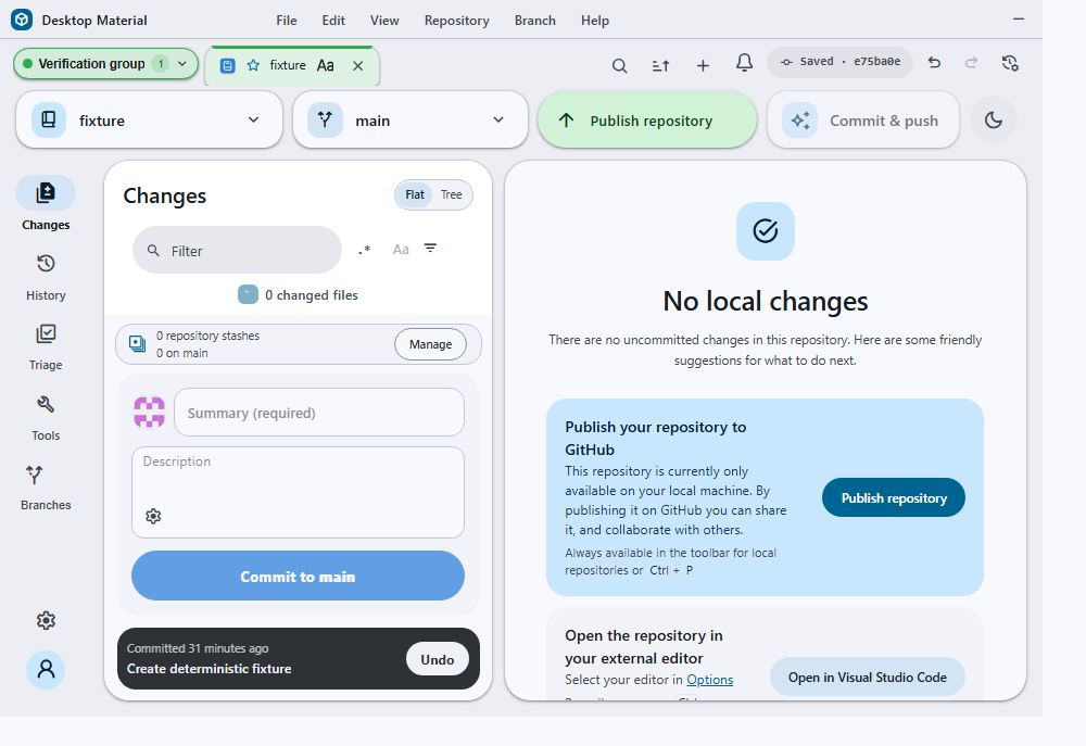
This immutable July 22 frame preserves the accepted bytes from that milestone; it is not current-build visual evidence for the #94/#95 corrections below.
Behavior and configuration
Right-click any tab to reach its group actions:
- Add tab to new group… opens a small dialog for the group's name and one of six curated colors (blue, green, yellow, red, purple, grey). The right-clicked tab becomes the group's first member.
- Move tab to group… is one stable menu item regardless of whether the profile has two groups or two hundred. It opens a bounded, searchable destination dialog instead of expanding every group into the native context menu. Choosing a group moves the tab beside that group's last member, so the group remains one contiguous run. A grouped tab also gets a No group destination that removes only its label and leaves the tab open. Incompatible pinned/unpinned destinations are omitted because no group may cross the strip's protected pin boundary.
- Collapse/Expand “name” toggles the group's real strip state. Collapsing hides every member tab but keeps the named group chip visible; clicking the chip, or pressing Enter/Space while it is focused, expands the members again.
- Show tabs in “name” opens the group's member dropdown (see below).
- Edit group “name”… opens the rename/recolor dialog (see below).
- Delete group “name” removes the label only. Every tab that belonged to it stays open and simply becomes ungrouped.
Move destination dialog
The move dialog owns the scale problem that a native context menu
cannot. Its list is height-bounded and scrollable, exposes a live result
count, and filters group names without changing or closing a tab until a
destination is chosen. Plain text remains the default; substring and
regex are explicit modes through the shared
FilterModeControl and full regex builder. Invalid regex
input is reported inline, and an honest no-match state keeps the query
available for correction.
Focus begins in the search combobox. ↑/↓, Home/End move the listbox highlight, Enter/Space choose it, and Esc cancels. The dialog restores focus to the tab or overflow control that opened the context menu. Group names are ellipsized visually but retained in each option's full accessible name. The title, instructions, search copy, counts, no-match state, and announcements follow the active English, Cantonese, or bilingual mode.
The group chip cluster
Each group's chip is a two-control cluster: the pill itself folds and unfolds the group, and the trailing button beside it opens the group's member dropdown. Both are ordinary buttons, so both are reachable by mouse and by keyboard, and the strip reserves the width of the whole cluster when deciding which tabs overflow.
Member dropdown
The dropdown lists every tab in the group, including while the group is collapsed and its members are absent from the strip entirely. That is the point: before it existed, a collapsed group was a dead end — the only way to reach a tab inside it was to expand the group first.
Choosing a member stays one action. A single press selects that tab's repository, activates the tab, and closes the dropdown; there is no confirmation step and no second click.
It is a keyboard-navigable listbox driven from either its search
field or the list itself: ↑/↓ move the highlight,
Home/ End jump to the ends, Enter (and
Space, from the list) activates, and Esc closes.
The search carries the same stack as every other collection surface —
plain text by default, substring and regex as explicit opt-ins through
the shared FilterModeControl and its full regex builder —
and an invalid pattern reports itself without hiding a single
member.
The dropdown also carries the group's own actions at its foot: Edit group…, Collapse/Expand, and Delete group, alongside a line stating that deleting clears the label only and every tab stays open.
Edit dialog
Edit group… opens a dialog with the group's current name and its current curated color. Saving renames and recolors the group and nothing else: its membership, its position in the strip, the pin boundary, and every open tab are untouched, which is why the dialog's intro states the exact member count rather than implying an edit might disturb it. A blank or whitespace-only name keeps the confirm action disabled.
The rename and recolor reach the profile store the same way every other tab mutation does, so they survive restart, profile switching, and settings-history restore.
Where the group dialogs are drawn
Both group dialogs render inside the app's
#dialog-layer, the single top-level layer that owns every
floating dialog, rather than inline in the tab strip that opens them.
That layer is what supplies a dialog's whole geometry and elevation
contract: #dialog-layer dialog[open] sets
position: fixed, centres the dialog, bounds it to the
viewport, and puts it at --popup-z-index.
The distinction is not cosmetic. Dialog always carries
the tooltip-host class, and
.tooltip-host { position: relative } overrides the
position: absolute a <dialog> gets from
the user-agent stylesheet, so a dialog rendered anywhere else is laid
out as an ordinary in-flow box with z-index: auto. Rendered
inline it therefore became a flex item of the tab strip — stretching the
strip around itself and painting underneath the app bar's Fetch origin,
Commit & push and Build & run pills, which are positioned and
come later in the document. That was the defect in #92;
the layer membership, not a raised z-index number, is the fix and the
contract.
Tooltips (--tooltip-z-index), the Material context menu
on its own backdrop, notifications, and the regex-builder layer all
remain above or beside the popup layer exactly as before.
Manual movement preserves membership while a tab stays beside the rest of its group. Moving it outside that run explicitly ungroups only the moved tab. The A–Z, opened-time, repository-status, and favorite arrangements treat each named group as one stable block, using its first member as the block's sort key, so an unrelated tab can never be sorted into the middle of a group.
A grouped tab shows a colored band along its top edge and a matching tint on hover and while active. The group chip adds its name, color dot, member count, chevron, expanded state, and active marker without changing tab geometry, height, or minimum width. Successful changes announce what happened and return focus to the chip when a collapse, expansion, or move would otherwise remove the focused tab from view.
Drag preview and recently closed tabs
Dragging now has a visible, bounded drop target: the lifted tab rises with a small tilt and shadow, the compatible target gains a tonal highlight, and a pulsing accent rail marks whether the drop will land before or after it. The preview is cleared on drop, cancellation, or a rejected pinned/unpinned boundary crossing. Keyboard movement remains available, so drag is an enhancement rather than the only route to reorder tabs. Reduced-motion users get the same target and announcement without the transforms or pulse.
The trailing tab-strip history button opens Tab history, a local list of up to twelve recently closed tabs. It has its own plain-text search with explicit substring/regex modes and the shared regex builder. Restore returns the original tab object, including its group, pin, favorite, label, and appearance; Forget removes one entry, and Clear history removes the list without touching open tabs. Repository-removal cleanup is intentionally excluded from the reopen list because the repository is no longer available. The list is stored per profile and window, with older profiles treating the optional list as empty.
Groups are stored per profile and per window alongside the tabs themselves. Open, close, bulk-close, session-import, reload, and legacy-primary mirroring preserve the group array, so names, colors, membership, collapse state, and unknown forward-compatible fields survive restart, profile/window switching, and settings-history restore.
IProfileTabsState.closedTabs is optional and bounded by
the store; profiles written before tab history existed continue to load
with no reopen entries.
All group actions, dialog copy, state announcements, accessible names, color names, and chip descriptions follow the persisted language mode: English, playful Hong Kong-style Cantonese, or compact bilingual text. English remains the fallback for an unknown mode.
Persistence and compatibility
IProfileTabsState.groups and
IRepositoryTab.groupId are both optional. A profile written
before groups existed loads unchanged and needs no migration or rewrite.
Both the tab and group records retain unknown keys, so a session written
by a newer release and then opened by an older one does not lose fields
it does not understand.
A groupId that does not match any declared group is
treated as ungrouped rather than discarded, so a downgrade followed by
an upgrade does not silently strip membership.
Portable File → Export current tabs… files
intentionally omit group definitions and each tab's
groupId. Groups belong to the destination profile, and
exporting membership without its profile-local definition would create a
dangling reference. Import still preserves the current profile's group
definitions while replacing or merging the portable tab list.
Failure modes and recovery
Creating a group with a blank or whitespace-only name is rejected and the dialog's confirm action stays disabled. Names are whitespace-collapsed and truncated to 64 characters on entry.
Moving a tab to a group id that no longer exists ungroups it instead of leaving a dangling reference. Deleting a group is always non-destructive to tabs; there is no path from group management to closing a repository tab. A move that would mix pinned and unpinned members is a safe no-op and does not write an invalid order. A malformed profile that already mixes pin kinds keeps the first member's side and safely treats incompatible later members as ungrouped while compacting valid members into one run.
The move chooser is stricter than the low-level repair behavior because its options can become stale while the dialog is open. Activation rereads the live source tab, destination group, current membership, and pin boundary in the same turn that starts the mutation. A closed source, deleted non-null destination, removed current group, or newly incompatible pin state dismisses the chooser, announces failure, restores focus to a still-connected owner, and performs no group write. Closing and later reopening a tab with the same stable id cannot resurrect the old chooser request.
Transient group rows and controls can disappear while their keyboard
tooltip is pending or visible—for example, when filtering, collapsing,
or deleting their owner. The shared tooltip lifecycle observes
connectivity only during that pending/visible interval. Removing the
owner cancels timers, removes the portal, stops viewport and mutation
observers, clears the tooltip marker and aria-describedby,
and never leaves disconnected help floating over the next surface. This
is the regression boundary for #94.
Security considerations
Group colors come from a closed, curated set and are re-validated on every read and render. An untrusted or corrupted persisted color falls back to the default rather than reaching an inline style, so a hand-edited profile cannot inject arbitrary CSS through a group. Group names are rendered as text and are never interpreted as markup.
Verification
The group contracts are covered across
tab-groups-test.ts, repository-tab-test.ts,
profile-tabs-file-test.ts,
tab-session-file-test.ts, and the tab-strip surface checks.
Coverage includes curated-color validation, visible/collapsible chips,
profile/window persistence, safe repair of malformed records,
pin-boundary rejection, non-destructive deletion, atomic manual/sorted
ordering, portable-export stripping, localization, focus, and
announcements.
app/src/ui/repository-tabs/tab-count-copy.ts owns the
one-versus-many selection used by every tab-group count phrase. In
English, exactly one uses tab/stays while zero and
two-plus use tabs/stay across the group chip,
edit-dialog intro, member-menu button/status, and overflow-button
accessible name. Cantonese keeps its natural count wording through the
same selection contract. The focused suite checks 0, 1, and 2 in both
languages plus the real collapsed-group and overflow-button accessible
names, covering #95.
app/test/unit/ui/tab-group-management-test.tsx covers
the chip cluster's newer surfaces: a collapsed group listing every
member in its dropdown, one-action member switching, arrow/Home/Enter
keyboard navigation with a live aria-activedescendant,
deletion from the dropdown leaving every tab open, the bilingual
rendering of the dropdown's copy, and the edit dialog renaming and
recoloring a group — persisted to the profile store — without touching
its membership.
Its move tab to group chooser block proves that the native context menu keeps exactly one enabled move command with zero groups and with 240 groups; the destination dialog filters 240 rows to one and activates it in one keyboard action; Space ungroups only a grouped tab; Cantonese roles/names and Escape focus restoration remain intact; and a disappeared source, deleted destination, later same-id tab, or changed pin boundary performs no mutation and emits no false success. Together with the registry and responsive-style files, the focused chooser gate is 30/30 tests across three files.
Its tab group dialog stacking block pins the layering
contract: the new-group dialog opened from a tab's context menu and the
edit dialog opened from the member dropdown must both land inside
#dialog-layer, and the strip itself must contain no
<dialog> at all.
app/test/unit/floating-surface-style-test.ts adds the
source-level half of the same contract, including the
.tooltip-host rule that makes an unportalled dialog fall
into normal flow in the first place.
app/test/unit/ui/tooltip-viewport-test.tsx adds the
disconnected-owner half: one regression removes a target before its show
delay expires, and another removes a visible target without
blur or mouseout. Both require the portal,
marker, and accessible description to be absent afterward.